Tallest First
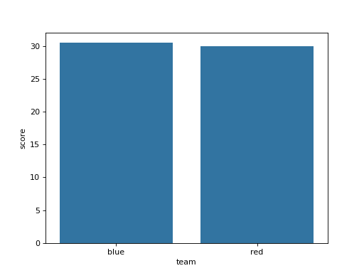
A ranking reads best sorted. df has columns team and score. With seaborn, show each team's mean score as a bar (errorbar=None), placing the teams from the highest mean on the left to the lowest on the right. No two means are equal. Draw it on a chart made with fig, ax = plt.subplots() by passing ax=ax, and return the figure.
Checked: the bars and the x tick labels.
Example 1
df {"team":["red","blue","red","blue","red"],"score":[10,20,30,41,50]}
draws
Constraints
- 2 to 5 teams,
len(df) <= 60
Write it in your browser, against the clock. The model solution, stepped through line by line, comes after.
More seaborn problems
- Trend Through the DotsEasy
- A Chart per GroupMedium
- A Trend per GroupMedium
- Counts in a Chosen OrderMedium
- How the Columns Move TogetherMedium
- Means Joined by LinesMedium
- Pivot Then ColorMedium
- Share Below Each ValueMedium