A Chart per Group
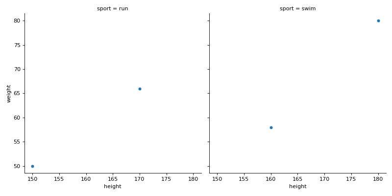
df has columns height, weight and sport. Instead of coloring one crowded chart, give every sport its own: use seaborn's figure-level relplot to draw weight against height as scatter plots in one row of charts, one column per sport. The function returns a grid object, not a chart: return its figure.
Checked: the title, where each chart sits and the points.
Example 1
df {"height":[150,160,170,180],"weight":[50,58,66,80],"sport":["run","swim","run","swim"]}
draws
Constraints
- 2 to 4 sports,
len(df) <= 40
Write it in your browser, against the clock. The model solution, stepped through line by line, comes after.
More seaborn problems
- A Trend per GroupMedium
- Counts in a Chosen OrderMedium
- How the Columns Move TogetherMedium
- Means Joined by LinesMedium
- Pivot Then ColorMedium
- Share Below Each ValueMedium
- Stacked ShapesMedium
- The Average LineMedium