Means Joined by Lines
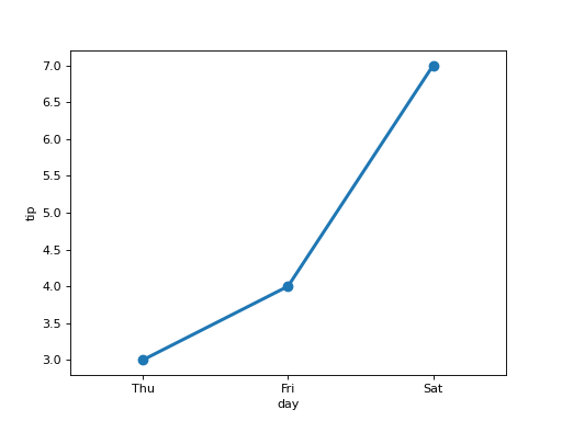
df has columns day (a weekday name) and tip, with several rows per day, and the rows of each day arrive together. Draw a seaborn point plot: a dot at the mean tip of each day, in the order the days appear, the dots joined by lines, without error bars. Use an ax you create and return the figure.
Checked: the lines and the x tick labels.
Example 1
df {"day":["Thu","Thu","Fri","Fri","Sat","Sat"],"tip":[2,4,3,5,6,8]}
draws
Constraints
- 2 to 6 days with 1 to 6 rows each
Write it in your browser, against the clock. The model solution, stepped through line by line, comes after.
More seaborn problems
- Pivot Then ColorMedium
- Share Below Each ValueMedium
- Stacked ShapesMedium
- The Average LineMedium
- A Histogram per GroupHard
- A Line per PanelHard
- Bars That Say Their NumberHard
- Bars per PanelHard