A Trend per Group
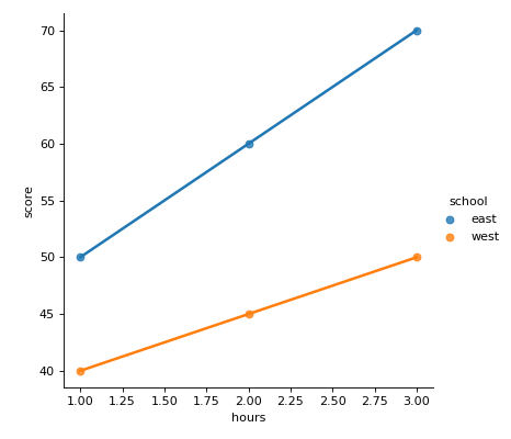
df has columns hours, score and school. Use seaborn's lmplot to draw score against hours as a scatter plot with a separate least squares line for each school, in different colors on one chart, without the shaded bands (ci=None). The function returns a grid object, not a chart: return its figure.
Checked: the points and the lines.
Example 1
df {"hours":[1,2,3,1,2,3],"score":[50,60,70,40,45,50],"school":["east","east","east","west","west","west"]}
draws
Constraints
- 2 or 3 schools with at least 3 rows each,
len(df) <= 45 - The hours of each school are not all equal
Write it in your browser, against the clock. The model solution, stepped through line by line, comes after.
More seaborn problems
- Counts in a Chosen OrderMedium
- How the Columns Move TogetherMedium
- Means Joined by LinesMedium
- Pivot Then ColorMedium
- Share Below Each ValueMedium
- Stacked ShapesMedium
- The Average LineMedium
- A Histogram per GroupHard