How the Columns Move Together
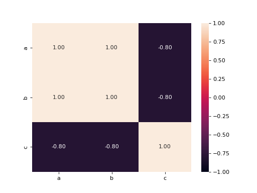
df holds a few numeric columns. Compute the correlation of every column with every other and show the table as a seaborn heatmap whose colors run from -1 to 1 (vmin=-1, vmax=1), with each correlation written in its cell with 2 decimals. Draw on an ax you create and return the figure.
Checked: the grid of values, the x tick labels, the y tick labels and the texts.
Example 1
df {"a":[1,2,3,4,5],"b":[2,4,6,8,10],"c":[5,3,4,1,2]}
draws
Constraints
- 2 to 5 columns, 5 to 40 rows, no column constant
Write it in your browser, against the clock. The model solution, stepped through line by line, comes after.
More seaborn problems
- Means Joined by LinesMedium
- Pivot Then ColorMedium
- Share Below Each ValueMedium
- Stacked ShapesMedium
- The Average LineMedium
- A Histogram per GroupHard
- A Line per PanelHard
- Bars That Say Their NumberHard