A Line per City
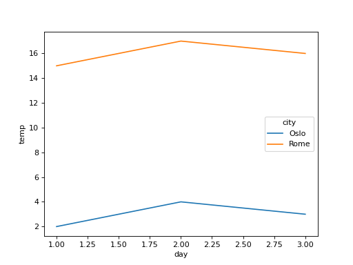
Temperatures were logged in several cities: df has columns day, city and temp, with one reading per city per day. Show with seaborn how temp changes over day, as a separate colored line for each city. Draw it on a chart made with fig, ax = plt.subplots() by passing ax=ax, and return the figure.
Checked: the lines and the legend.
Example 1
df {"day":[1,2,3,1,2,3],"city":["Oslo","Oslo","Oslo","Rome","Rome","Rome"],"temp":[2,4,3,15,17,16]}
draws
Constraints
- 2 to 4 cities, 2 to 15 days
Write it in your browser, against the clock. The model solution, stepped through line by line, comes after.