Boxes per Team
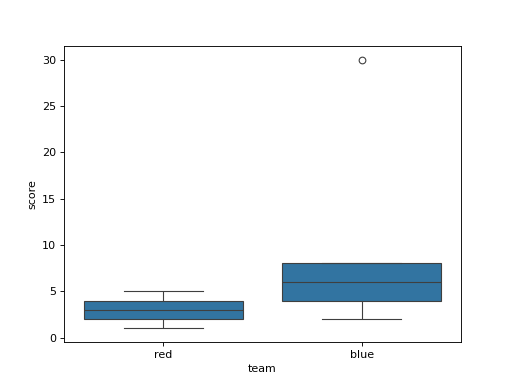
df has columns team and score. Draw a box plot with one box per team with seaborn's default settings, to compare how the scores of each team are spread. Draw it on a chart made with fig, ax = plt.subplots() by passing ax=ax, and return the figure.
Checked: the lines and the x tick labels.
Example 1
df {"team":["red","red","red","red","red","blue","blue","blue","blue","blue"],"score":[1,2,3,4,5,2,4,6,8,30]}
draws
Constraints
- 2 to 4 teams with 5 to 9 rows each
Write it in your browser, against the clock. The model solution, stepped through line by line, comes after.
More seaborn problems
- Dots From a TableBeginner
- How Many of EachBeginner
- Line From a TableBeginner
- Shape of a ColumnBeginner
- Table as ColorsBeginner
- A Line per CityEasy
- Bars by Two KeysEasy
- Colored by GroupEasy